Il nuovo numero di Architectural Review è dedicato a libri e biblioteche

Il rapporto tra libro e architettura è un rapporto strettissimo, che va ben al di là della semplice formula libro + architettura = libro di architettura.
Ci sono anche le architetture che ospitano i libri — cioè le biblioteche e gli archivi — nonché i libri stessi, vere e proprie “architetture del testo”.
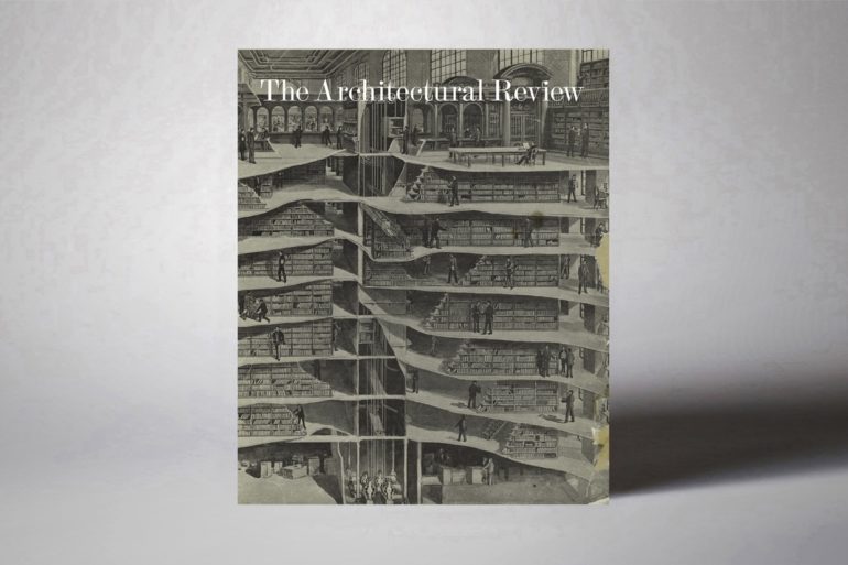
A tutti e tre gli aspetti è dedicato il nuovo numero di Architectural Review, la prestigiosa rivista britannica che è anche tra le più longeve oggi in circolazione, essendo stata fondata addirittura nel 1896.

Le pagine del Book Issue sono infatti un viaggio multidimensionale nel concetto stesso di libro: il libro come architettura, appunto, ma anche le architetture dentro e attorno ai libri. E inoltre: il rapporto tra strutture, testi e simboli; biblioteche antiche e moderne; edifici che assomigliano a libri, e viceversa.
C’è anche un volumetto interno, intitolato The book of books, che è una sorta di wunderkammer a tema “libro”, piena di ottime trovate grafiche ispirate al design dei volumi.

Architectural Review n. 1457 si può acquistare online.

Visualizza questo post su Instagram

From the 1837 edition of Plans, Elevations, Sections and Details of The Alhambra by Owen Jones, this drawing of an arched window shows the Arabic inscriptions that adorn the 14th-century Moorish palace in Granada, Spain. The walls read like the pages of a book of poems, designed by Arabic artisans and poets employed in the court of King Yusuf I. Carved out of plaster, the script entangles with vegetal carvings framing portals and winding around archways. This month's folio appears in print in the AR Book issue – follow the link in our bio to get your copy today 👆 Image courtesy of Victoria & Albert Museum, London • #alhambra #elevation #drawing #architecture #palace #building #spain #moorish #granada #calligraphy

Un post condiviso da The Architectural Review (@thearchitecturalreview) in data:

Visualizza questo post su Instagram

‘Paper and ink could hold the texture of architectural materials; facing pages offered a surface for contents to engage in dialogue; sequences granted the capacity to generate rhythms; indexes and headers helped navigate the book structure, while the book itself is of a size that relates to the body of the reader’ 🙇 In our latest issue, André Tavares ponders the architectural monograph 📖 follow the link in our bio to get your copy today! 👆 Image: Sigfried Giedion working on the Italian version of Space, Time and Architecture in 1954. Courtesy of GTA Archives / ETH Zurich, Ulrich Stucky • #monograph #architecture #print #printisnotdead #andrétavares #larsmüller #sigfriedgiedion #paper #blackandwhite #book #books #publishing #bandw #architecturalreview #spacetimearchitecture #50s #archive

Un post condiviso da The Architectural Review (@thearchitecturalreview) in data:

Un messaggio

Frizzifrizzi è sempre stato e sempre rimarrà gratuito. Si tratta di un progetto realizzato ogni giorno con amore e con impegno. La volontà è di continuare a farlo cercando di tenere al minimo la pubblicità. Per questo ti chiediamo una mano — se vorrai — con una piccola donazione. Potrai farla su PayPal.

GRAZIE DI CUORE.